
Page 41 - Build 152
P. 41
Handrails and other features
Other features that can make the home easier and safer include:
● stair handrails that extend beyond the stairs at
the top and bottom to give warning that they
begin or end
● handrails that are easy to grasp and securely
xed as visual impairment can a ect the sense
of balance
● avoiding small changes of level or, if this is not
possible, avoidance of angles or curves at tread
edges or corner steps (see Figure 1)
● a secure outdoor area for a guide dog.
Designing public buildings
Public buildings rely on sight for navigation, so unfamiliar buildings can be very di cult for blind or visually impaired people to move around in.
There are, however, some design features that can be incorporated to facilitate movement through unfamiliar buildings for people who cannot see.
Acoustic design important
Blind or visually impaired people make more use of their other senses, in particular, hearing, to detect sounds such as the ping of an elevator to pinpoint its location. Changes in acoustics
in di erent spaces or the sounds from walking over or tapping di erent oor nishes are other examples.
When there are too many other sounds, such
as music or excessive reverberation from hard surfaces, the sounds that aid navigation may not be audible. Acoustic design and managing sound therefore needs to be a signi cant consideration in the design of public buildings. For example:
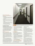
Figure 2
Dark doors, oor coverings and handrails provide good contrast with white walls.
●
●
select materials and nishes that facilitate changes in acoustics, such as indicating the size of a room or the presence of corridors or structural barriers
provide tactile indicators, such as di erent oor nishes, to indicate a transition from one area to another.
● de ning a route of travel
● de ning areas
● drawing attention to signage.
There should be good contrast between doors and walls and between oors and walls (see Figure 2). A perimeter band of contrasting colour that de nes the transition between oor and wall can be e ective when the oor and wall colours are similar.
Stair handrails should be colour contrasted with the walls and stair nosing colour contrasted at the front edge of each step.
Tactile indicators should be installed at the top and bottom of stairs, escalators and travelators.
Colour can be used to de ne speci c spaces, for example, the same colour for each area with the same function in the building. Keep colour schemes simple, limit use of colour and, for adjacent blocks of colour, select colours with good contrast. Avoid the use of large-
Good lighting design
As with residential design, good lighting to aid navigation is essential in public buildings. The same rules apply including:
● distributing lights evenly throughout an area
to avoid contrast and variations in light levels ● locating light sources to avoid creating shadows ● avoiding glare and re ection from shiny or
glossy surfaces
● ensuring there is good surface or task lighting
for the activity being undertaken.
Contrast, colour and tactile indicators
Contrast and colour can facilitate movement around unfamiliar buildings by:
Build 152 — February/March 2016 — 39
